These days, I thought a lot about the colours, materials and furniture about my kiosk. I love various combinations of diverse colours, materials and furniture.Different ways of combination gives people different feeling.
First, I want to talk about the colour.My favorite contrast colours are red and green which are strong and pure. When I read the advertisement of Cartier(Their poster's colour was made of red and green), I realized that I love the assembly of red and green.
 |
| I cannot find the original poster, but I still remember the colours are like that. They are elegant. |
 |
| Henri Matisse"DANCE" |
 |
| Henri Matisse"RED ROOM" |
 |
|
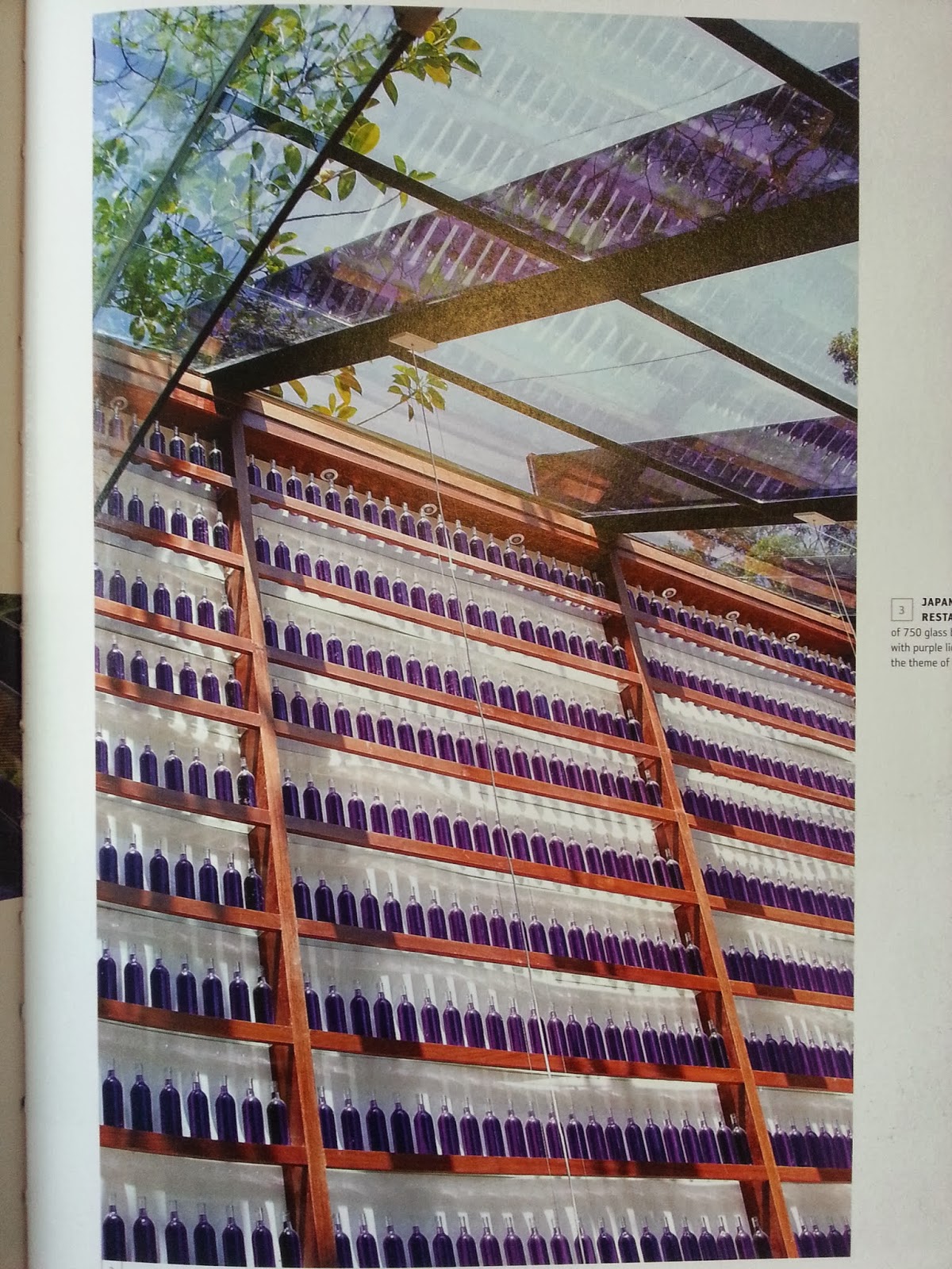
The Brazilian architect Brunete Fraccaroli designed the Japanses barbecue restaurant. Her colour has the feminine charm.


Home design in Australia.

I also find some in graphic design.

.jpg)


I also find some in graphic design.

.jpg)
WOW! I have to say there are so many choices! My mind is a little confused! When I moved my eyes from the screen, I saw......

Yes!!! It is that kind of colour I want, is not it? Transparent violet and warm colour of kraft on the wall. It is a mixture---- mysterious, stable and peace.
No comments:
Post a Comment